
Good signage
One of the guiding principles of good design is functionality. When pertaining to signage, one of the most important features of functionality is visibility. The following examples show examples of signage that are visible from afar.


I love this example of wayfinding in Imaginarium a 3D printing facility in Mumbai, India. The different departments are color-coded and lines on the floor lead visitors directly to their destination. I love how the lines go all the way up the doors and end in markers that jut out of the door, marking the end of the line.


Bad signage
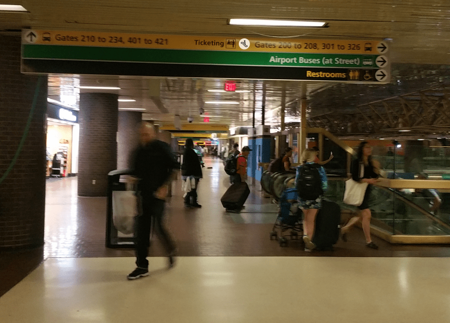
Signs at Port Authority bus terminal are very inconsistent in marking the ticketing locations. There are plenty of signs marking the gates, but the signs seem to include ticketing windows only occasionally. There is a distinct lack of directions to ticketing booths at the key decision points, of which there are plenty thanks to the boxy nature of the building. What’s worse, on the second floor of the south wing of the terminal, there is only a single sign marking that the ticketing booths are on the first floor. It is a poorly accessible sign right in front of the escalator going down.


This problem can easily be fixed by including markers for ticketing in the existing signage, as in the image below.
If one wants to take a look at bad signage one does not need to go far from Port Authority it seems. Right in front of the ticketing booths, there are signs pointing to gates 1-34 along the length of a 150 meter long corridor. The gates are arranged in an orderly fashion on the lower floor, but on the upper floor, there is no mention of which escalator should be taken for which gate. I was led on a sprint through the terminal only to end up right under where I started after about a 250m dash.


Further notes on Port Authority signs: Sign design throughout the terminal is consistent and simple. They use Arial font and simple icons, most of which are available for free on the noun project. The color scheme of green for streets and subways, black on yellow for gates and ticketing, and yellow on black for restrooms, information, police etc. is consistent throughout the terminal. Except for the lack of signage at places and ill-advised placement of some signs, I really like this system.
