Boarding pass redesign

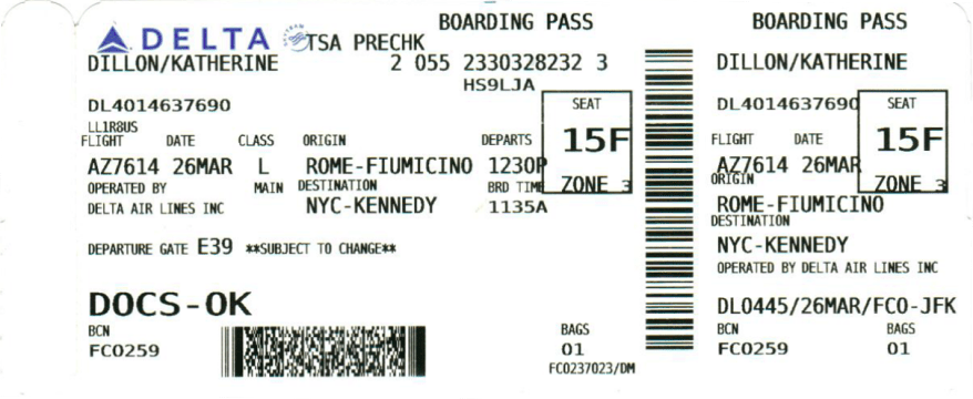
You know how when you get your boarding pass the teller highlights the boarding time and the gate? The fact that they have to do it is a testament to the abysmal design of boarding passes.

Through this assignment, I got interested in the design history of boarding passes. Turns out, the machine-readable component of boarding passes is regulated by the International Air Transport Association (IATA). But, as far as I can tell, there is no regulation on the human-readable elements. So, the only reason that we have these awful boarding passes is that some engineer who was only interested in the boarding pass barcodes made up a template for boarding passes which has been followed out of inertia since. Here’s an example from the ‘Recommended BCBP document layout‘:

Selection_001
An example template from IATA. Notice how the only point of concern is the dimension of the barcode.

Why then are we still suffering from awful boarding passes like this:

Selection_002.png

Here is an attempt to redesign this monstrosity:

new_boarding_pass.png

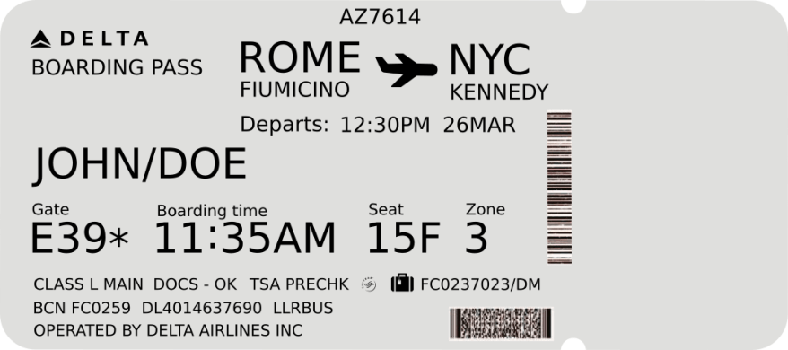
Font used: Bitstream sans

Side note: If you’re interested in what information is contained in the barcode on the boarding pass, it’s easily decoded with a simple app. It is PDF417 format data-matrix code and contains mostly the same information as typed on the pass. But it can contain a lot more information as well, including the sequence number and frequent flyer number. More details in the IATA implementation guide.

Welcome to ITP Mars Simulator

This floor has been transformed into a floor on the ITP “Mars Simulator.” Recruits reside here for two years in preparation for a stay on the red planet.

ITPFLOORPLAN
Map and directions

Transcript

(Elevator door opens)

Hello! Welcome to the ITP mars habitat simulator. I’m Gwen, your guide. Come with me.
As you know you’ll be spending the next two years in this self-contained unit, training for your trip to mars.

You’ll be here with the other recruits, testing the limits of human cohabitation, living and learning together.

Let’s take this left here…

(pause, walking, sound of cane and footsteps)

To your left is the Earth room. We are currently testing simulations of different locations on Earth; for recruits to go when they feel homesick

First, we are prototyping a rainforest: (Sound of rain, rainforest animals) …

As well as a field in the countryside (Sound of crickets, running stream)…

And the ocean: (Ocean sounds)

We also are working on a big city: (Sound of New York City, people walking on sidewalks, cars beeping, etc.)

Next I’ll show you where we are building the dorms… Follow me.

(pause walking)

The 3D printers will be moved soon, but they’ll remain in the habitat for repairs and maintenance.

The terrarium will be fitted here by the way, the unit will be self sustained for food and oxygen recycling.

(pause, walking, sound of cane and footsteps)

(Sounds of construction start happening in background)

This is where you and the other recruits will be sleeping. We are installing the oxygen tanks and testing the the cabin pressure.

Hey mark! could you use the oxy-acetylene torch away from the cylinders? You’re going to blow the whole unit sky high!

Let’s go to the meeting room, and meet the other recruits…

I was once a recruit, too, you know. But I had an accident onboard the ship and that’s why I’m using this cane… (Sound of explosions) (People running)

Oh no!

(Sounds of commotion fade out…)

PopEye – a safety glass addon

It is not a pretty sight when a drill bit rotating at 20,000 rpm gets caught on a work-piece. Even a light foam core model then seems like a deadly projectile, especially if it’s headed straight for your eye. This happened to me a few months back. What makes it worse is that I had my safety glasses right on my forehead! I had pulled them up to examine the part for a minute and forgot to put them back on. I want to make sure that this doesn’t happen again. Hence, PopEye.

PopEye is a safety glass add-on that detects when you take your glasses off and cuts power to the tool you’re using. It seems like a relatively straightforward idea, and for the most part, it is. One can use a Bluetooth low energy beacon placed on the glasses. The beacon is switched on whenever the glasses are put on. An accompanying power relay will go between the mains supply and the power tool. It will listen for the beacon packets and will switch off the power if it can’t detect the beacon. This entire setup can be completed quickly over a weekend. I explored IR and other wireless protocols as well, but the simplicity and extensibility of BLE make it the best choice. So, the major challenge is to detect when the glasses have been put on correctly.

3M_safety_glasses
3M 91252-80024 glasses.

Before proceeding much further, it is important to narrow down a bit and focus on a particular type of safety glasses. Safety glasses come in at least half a dozen different configurations. I chose to focus on over prescription glasses type, with an elastic band instead of stems. The elastic band will ensure direct contact with the face, making detection easier. I chose to go with 3M 91252-80024 glasses(image below). It is a cheap and effective choice. Although I will guide the design to have high dimensional tolerance so that it will work with any similar glasses.

Safety glasses on forehead
Strong contact with the forehead marked in red.

Back to the problem at hand, detecting when the glasses have been put on. When I put on the glasses, right away I noticed a few points of detection. The forehead/brow, arch and cheekbone regions make a tight direct contact with the skin when the glasses are put on correctly. I would imagine, based on facial anatomy, the arch and cheekbone contacts can be interchanged for support at the bottom, but the forehead must necessarily make good contact with the glasses. More importantly, if I move the glasses up to my forehead, there isn’t a strong contact. So, we have a long (~10cm) strip which makes good contact only when the glasses are put on correctly.

To detect contact in this region, a light touch micro-switch easily comes to mind. It can be placed on any part of the glasses which come in contact with the skin only when the glasses have been put on correctly. But it can get false positives, e.g., if the glasses are packed inside a bag.

Using skin conductivity is the next best idea. Two conductive pads can be placed on the top of the glasses such that they contact the forehead when the glasses are put on properly (see image above). If the glasses are not put on properly, the circuit will be open. A microcontroller can then read the resistance between the pads and only switch on the BLE beacon when the resistance is in a sensible range, say 1K to 1M ohms. This will prevent accidental switching on if the glasses are packed in a box, even if placed along with metal tools -thus shorting the pads. It is unclear if a microcontroller is needed, a clever analog switch should be able to achieve this while saving cost and -more importantly- power.

After doing some experiments with this, I found that this method works most of the time. Of the six people I tested on, only one person had a facial structure that prevented the pads from making contact with the skin. (Image above.)

NFC can be used to quickly pair safety glasses to a tool. So, in a shared workshop, people can sign punch in and punch out tools by simply waving their safety glasses close to the power terminal for the tool.

The next steps for development are as follows:

  • Test different pad configurations: length and separation of pads, material: conductive cloth, pogo pins, copper tape, spring contacts..
  • Explore analog circuits for switching power to the BLE beacon.
  • Procure and test BLE and beacons, and RFID/NFC tags.
  • Design PCBs to fit the brow of the glasses.

Signange

Good signage

One of the guiding principles of good design is functionality. When pertaining to signage, one of the most important features of functionality is visibility. The following examples show examples of signage that are visible from afar.

I love this example of wayfinding in Imaginarium a 3D printing facility in Mumbai, India. The different departments are color-coded and lines on the floor lead visitors directly to their destination. I love how the lines go all the way up the doors and end in markers that jut out of the door, marking the end of the line.

Bad signage

Signs at Port Authority bus terminal are very inconsistent in marking the ticketing locations. There are plenty of signs marking the gates, but the signs seem to include ticketing windows only occasionally. There is a distinct lack of directions to ticketing booths at the key decision points, of which there are plenty thanks to the boxy nature of the building. What’s worse, on the second floor of the south wing of the terminal, there is only a single sign marking that the ticketing booths are on the first floor. It is a poorly accessible sign right in front of the escalator going down.

This problem can easily be fixed by including markers for ticketing in the existing signage, as in the image below.

Fixed signage.png

If one wants to take a look at bad signage one does not need to go far from Port Authority it seems. Right in front of the ticketing booths, there are signs pointing to gates 1-34 along the length of a 150 meter long corridor. The gates are arranged in an orderly fashion on the lower floor, but on the upper floor, there is no mention of which escalator should be taken for which gate. I was led on a sprint through the terminal only to end up right under where I started after about a 250m dash.

Further notes on Port Authority signs: Sign design throughout the terminal is consistent and simple. They use Arial font and simple icons, most of which are available for free on the noun project. The color scheme of green for streets and subways, black on yellow for gates and ticketing, and yellow on black for restrooms, information, police etc. is consistent throughout the terminal. Except for the lack of signage at places and ill-advised placement of some signs, I really like this system.


Sound Walk – Group Project

“ITP space habitat” is a sound walk where you as a recruit get a tour of the habitat by a veteran astronaut. The space theme was inspired by the Applications class, and it allows us to work with some weird sound effects.


Sounds for editing (freesound.org):

1. Elevator door opening:
https://www.youtube.com/watch?v=dJ8JmnhvVS4

2. Earth room
– Rainforest room:
https://soundcloud.com/sounds-itp/sets/rainforest-room-sounds
– Ocean room:
https://soundcloud.com/sounds-itp/sets/ocean-room-sounds
– Countryside room:
https://soundcloud.com/sounds-itp/sets/countryside-room-sounds
– City room:
https://soundcloud.com/sounds-itp/sets/city-room-sounds

3. Dormitory
– Construction sounds:
https://soundcloud.com/sounds-itp/sets/construction-sounds

4. Explosion:
https://soundcloud.com/sounds-itp/sets/explosions

Original recordings:

1. Cane sounds:
https://soundcloud.com/sounds-itp/sets/cane-sounds

2. Voiceover:
– Kemi to record voiceover (week 2)

Rough draft of the narration:

(Elevator door opens)
Hello! Welcome to the ITP space shuttle. I’m Gwen, your guide. Come with me…

(pause, walking, sound of cane and footsteps)

This is the Earth room. We are currently test driving simulations of different locations on Earth, for recruits to go in when they are homesick for our home planet.
First, we are prototyping a rainforest: (Sound of rain, rainforest animals) …
As well as a field in the countryside (Sound of crickets, running stream)…
And the ocean: (Ocean sounds)
We also are working on a big city: (Sound of New York City, people walking on sidewalks, cars beeping, etc.)

Next, I’ll show you where we are building the dormitories… Follow me.
(pause, walking, sound of cane and footsteps)
(Sounds of construction start happening in background)
This is where you and the other recruits will be sleeping. We are currently installing the oxygen tanks and testing the pressurization of the cabin.
Now we will go to the meeting room, where you will meet the other recruits…
(pause, walking, sound of cane and footsteps)

(Sounds of chatting)
This is where we will be holding the training.
I was once a recruit, too, you know. All of us senior members here were. Now I am a veteran due to an accident I had onboard the ship… (Sound of explosions) (People running)

Quick! Duck! There’s been an explosion in the dormitory!
(Sounds of commotion fade out…)

Video and Sound – 1

Notes on “The Ecstacy of Influence – A plagiarism” by Jonathan Lethem.

The gist of the article as I read it is: Some of the greatest art would not be possible without plagiarism. Copyright laws are there to “promote the progress of science and the useful arts” and not to protect the creator’s self-interests. Great art is by definition a gift and it cannot exist in as a commodity. It is therefore important to allow art to go into the public domain and to promote second use. While doing this it is vital for creators to acknowledge their sources and pay homage to their roots.

This article forced me to articulate some of my own thoughts on piracy and ownership. I believe that great art is measured not by any objective quality, but by the number of lives it has touched and affected. Star Wars is made great not by the directors and the film crew, but by the teenage kid who goes to Comic-Con dressed as a Wookie. Should that kid be sued for stealing copyrighted material, or monetarily compensated for advertising the franchise? If the franchise is made successful by the public, shouldn’t the public own it? In a world of digital rights management, when your entire book collection can be wiped by someone at Amazon; what does it even mean to own something?

Notes on “Embrace the Remix” by Kirby Ferguson

“If I have seen further, it is by standing on the shoulders of giants.” the quote by Issac Newton may have been meant as a quip to Hooke, but that makes it no less valid. The greatest enterprise of humanity, The Scientific Revolution is built on free sharing of ideas. The ill conceived notion of equating creative property, with physical property -which can be stolen- is detrimental to progress. I firmly believe in free sharing and open-source. It is much better to allow everyone to work on the same, shared knowledge base than to stifle progress with artificial constraints.

Notes on “Her Long Black Hair” by Janet Cardiff

The woman in the red jacket will now forever be a part of my memories of Central Park. Starting out, I was a bit skeptical about the value of the sound-walk. I am an avid podcast listener and I thought that sound alone can create a landscape in the mind. So, I listened to the sound-walk on my way to Central Park from New Jersey. The things I missed on the first listen and the experience of having a moving scenery as I listened were simply staggering! The timing of cricket noises just as I pass by a bush, the subtle reverb in sound along with architectural changes and the melding of noises to a point where I couldn’t really tell if there was someone behind me added up to an unforgettable experience. Even though I didn’t relate to the story very much I shall not forget the woman in the red jacket.

Design Analysis

I selected a poster of the movie ‘My Neighbor Totoro‘ by artist Olly Moss. I think the poster does justice to the classic, capturing the essence of the movie in playful colors.

Original files on my github.

Cropped_Poster

Process:

GRID :

  • Lay out in gimp image editing software.
  • The color of the grid lines should be selected to contrast with all colors in the image.

COLORS :

  • Change the image mode to five indexed colors, letting gimp select the colors itself.
  • Identify the percentage cover of each color with the histogram tool in gimp.
  • Export the indexed image into InkScape.
  • Selecting the color using the eyedropper tool, make circles of area proportional to percentage cover of each color.
  • Align the circles to the right of the image.
  • Export the image along with the semicircles.

FONTS:

  • Open the image in InkScape.
  • Crop sections of image with each individual font.
  • Identify the font using WhatTheFont.
  • Use MyFonts to get sample text for each font (if the font is not free).
  • Grab the image samples and import them in InkScape.
  • Trace bitmap to get manipulatable vectors for the image.
  • Change the color and size of the vector to match the image context.
  • Export image from InkScape.