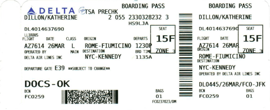
You know how when you get your boarding pass the teller highlights the boarding time and the gate? The fact that they have to do it is a testament to the abysmal design of boarding passes.
Through this assignment, I got interested in the design history of boarding passes. Turns out, the machine-readable component of boarding passes is regulated by the International Air Transport Association (IATA). But, as far as I can tell, there is no regulation on the human-readable elements. So, the only reason that we have these awful boarding passes is that some engineer who was only interested in the boarding pass barcodes made up a template for boarding passes which has been followed out of inertia since. Here’s an example from the ‘Recommended BCBP document layout‘:

Why then are we still suffering from awful boarding passes like this:

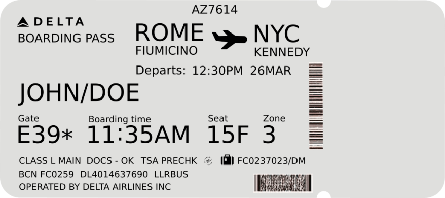
Here is an attempt to redesign this monstrosity:

Font used: Bitstream sans
Side note: If you’re interested in what information is contained in the barcode on the boarding pass, it’s easily decoded with a simple app. It is PDF417 format data-matrix code and contains mostly the same information as typed on the pass. But it can contain a lot more information as well, including the sequence number and frequent flyer number. More details in the IATA implementation guide.
